Graph View: visualize your data over time
The Dracal Technologies data acquisition system allows not only to record precision measurement data but also to visualize the data graphically.
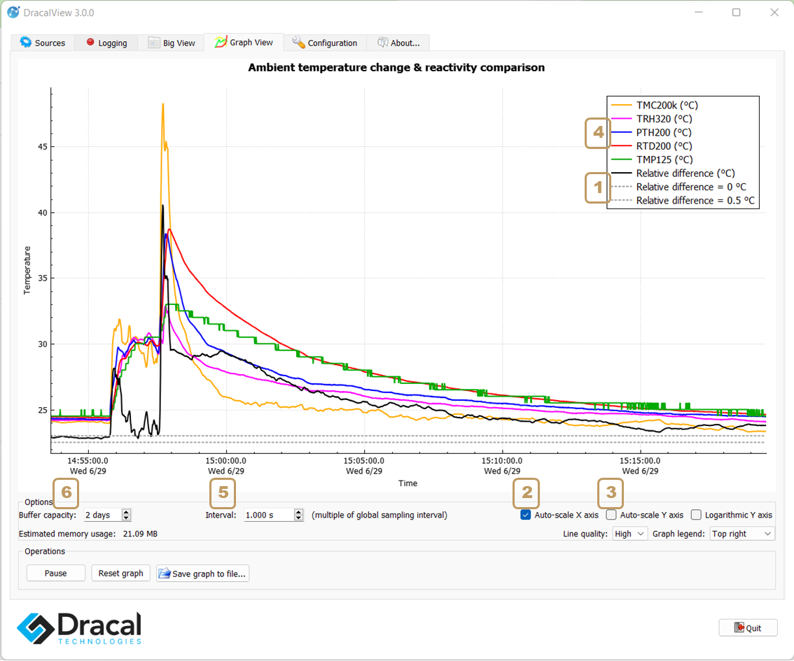
Note that real, virtual and mathematical channels [1] can all be added to the graph.
The 'Auto-scale X axis' box [2], when checked, allows you to see the record of all data since the connected device is visible on Graph View. The 'Auto-scale Y axis' box [3] adjusts the zoom to the minimum and maximum values displayed in the graph to allow you to appreciate the variation of the parameter(s).
When you click on one of the channels in the legend, you will see that you can easily change the color [4], thickness and line style of the channel.
The 'Interval' [5] is a multiple of the sampling rate defined in the “Configuration” tab. Additionally, you can set the 'Buffer capacity’ [6], which is the maximum number of data shown in the graph. After this duration, the first points will be discarded following the ‘first-in, first-out mechanism’.
For more details, watch this short video tutorial.